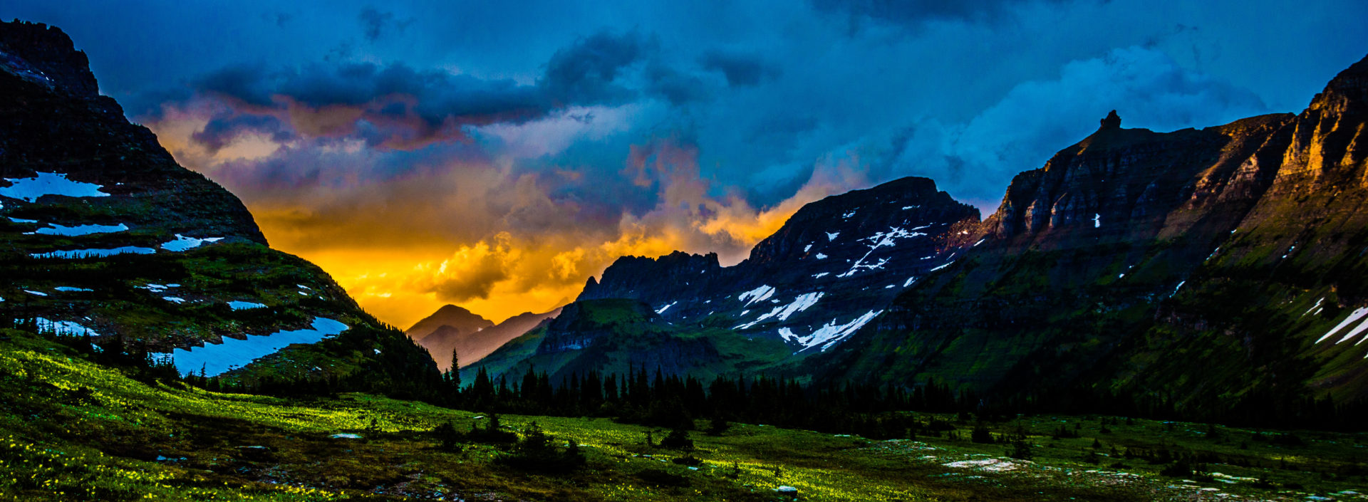
This is a composite of different images I made for a graphics class. The two different images used were taken by me nearly four years apart. The picture of the building (Academic Hall at Southeast Missouri State University) was taken in November 2013 while the picture of my grandmother was taken in February 2017.This is a composite I did for a graphics class of 6 different images featuring myself times 4.This is a cover/poster for the book Neuromancer by William Gibson I made for a graphics class.This is a close up of the head interface from my Neuromancer book cover/poster. I know the book described it as a lapis color but I based this design both on the android from “Metropolis” as well as C3PO from “Star Wars” and I wanted to make it a gold color.This is a cover/poster for the book Count Zero by William Gibson I made for a graphics class. This version isn’t very canon but I was running low on time so this version is a simplified version of the more complex and final version.This is a cover/poster for the book Count Zero by William Gibson I made for a graphics class. This is the more complex and canonical version in relation to the book. Not everything is exactly canon but it’s how I envisioned it when I first read the book.This is a close up of the Cornell-like box from my Count Zero book cover/poster design. I know that the book says there is only a blackened sliver of a bone from the human wrist in the box but I thought the whole hand looks better. The bio-meter attached to the wrist has Braun branding as described in the book as well as a “Made in Chiba City” tagline (a reference to Neuromancer).This is a cover/poster for the book Mona Lisa Overdrive by William Gibson I made for a graphics class.A composite I did for a graphics class. This is a redo of the very first composites I made (which are of the same subject and theme and can be seen near the bottom of this page).A composite I did for a graphics class. This is a redo of the very first composites I made (which are of the same subject and theme and can be seen near the bottom of this page).A composite I did for a graphics class. This is the first in set of two images (the second image is below).A composite I did for a graphics class. This is the second in set of two images (the first image is above).This a website design I made for a graphics class. The site is named after the obscure movie “Decasia.”This a website design I made for a graphics class featuring notes on what each element of the site would do in action. The site is named after the obscure movie “Decasia.”This a mobile website design I made for a graphics class. The site is named after the obscure movie “Decasia.”This a mobile website design I made for a graphics class featuring notes on what each element of the site would do in action. The site is named after the obscure movie “Decasia.”An infographic I did for a graphics class showing the storage capacity of different media, both optical and magnetic, in megabytes. I drew all the images.An infographic I did for a graphics class showing the storage capacity of different media, both optical and magnetic, in megabytes. I drew all the images.This is a logo I made in a graphics class for a fictional company. I also did an iteration of this logo featuring the fictional company Tessier-Ashpool from William Gibson’s Sprawl Trilogy.This is a logo I made in a graphics class for a fictional company. I also did an iteration of this logo featuring the fictional company Tessier-Ashpool from William Gibson’s Sprawl Trilogy.This is a logo I made in a graphics class for a fictional diner.This is a logo I made in a graphics class for a fictional company. The negative space around Outspoken Messaging creates a speech bubble.This is a logo I made in a graphics class for a fictional resort, although I named it after the 80s song of the same name.This is a logo I made in a graphics class for a fictional company found in William Gibson’s Sprawl Trilogy of books. This is an iteration of the Aoife-Caspian Medical Services Logo I designed.This is a logo I made in a graphics class for a fictional company found in William Gibson’s Sprawl Trilogy of books. This is an iteration of the Aoife-Caspian Medical Services Logo I designed.This is the tall version of the logo I made for myself in a graphics class. This is the second logo I’ve made for myself (the old logo is the “Zenex” logo) and this is the tall version of the logo. The font is called Mustang.This is the logo I made for myself in a graphics class. This is the second logo I’ve made for myself (the old logo is the “Zenex” logo) and this is the long version of the logo and the main version. The font is called Mustang. An animated version of this logo can be seen in the Downloads & Other Work section of this site of by clicking HERE.This is a magazine cover design I did for a graphics class and I also took the picture. This image is also used in my Butter Knife Magazine Website I built in Flash, which can be viewed on the Downloads & Other Work section of this site or by clicking HERE.This is a magazine cover design I did for a graphics class. This image is also used in my Butter Knife Magazine Website I built in Flash, which can be viewed on the Downloads & Other Work section of this site or by clicking HERE.This is a magazine cover design I did for a graphics class. This image is also used in my Butter Knife Magazine Website I built in Flash, which can be viewed on the Downloads & Other Work section of this site or by clicking HERE.This is a composite of multiple images I did for a graphics class and one of the first composites I ever did. None of the images were taken by me.This is a comparison of a photo manipulation I did in Photoshop. The original image is on the left and the altered image is on the right. This is a picture of a younger me on a boat in the Prince William Sound off the coast of Alaska.This is a comparison of a photo manipulation I did in Photoshop. The original image is on the left and the altered image is on the right.This is a comparison of a photo manipulation I did in Photoshop. The original image is on the left and the altered image is on the right. I tore this out of an old National Geographic Magazine and folded it and later scanned it.This is a long exposure I did for a graphics class. The concept is: Memories Are Forever – Meaning that memories can theoretically last forever in a digital form such as CDs. The stars in the picture represent eternity and memories of the past. Human memories and experiences can live on and become part of the universe itself (also giving meaning to the stars and the tree). This was a five second exposure and I waved a flashlight at the CDs to make them reflect. A full moon was rising behind the shed and some of its light can be seen above the letter E.This is a selective color image I made in Photoshop. I took the photograph in Vancouver, British Columbia in 2013.This is a selective color image I made in Photoshop. I took the photograph in Victoria, British Columbia in 2013.A mock-up of a redesign of the Nissan website I made for a graphics class. I’d later use the template for this site for my Butter Knife Magazine Website I built in Flash, which can be viewed on the Downloads & Other Work section of this site or by clicking HERE.A mock-up of a redesign of the Nissan website I made for a graphics class. I’d later use the template for this site for my Butter Knife Magazine Website I built in Flash, which can be viewed on the Downloads & Other Work section of this site or by clicking HERE.An ad I designed for a website redesign project for a graphics class. The photo is not by me.An ad I designed for a website redesign project for a graphics class. The photo is not by me.A redesign of the Nissan logo I made for a graphics class.A concept for a website I made in Adobe Illustrator. I’d eventually build this website in HTML5, which you can see on the Downloads & Other Work section of this site or by downloading the HTML5 files for the site HERE.This is an image collage I made for a graphics class featuring 10 different images showcasing the Apollo missions to the moon.This is a typography project I did for a graphics class featuring a quote from Queen Victoria. I took the photograph in Victoria, British Columbia in 2013.This is a typography project I did for a graphics class featuring a poem I wrote. I also took the photograph.This is a typography project I did for a graphics class featuring 1 Corinthians 13:12.This is a typography project I did for a graphics class featuring a line from the poem “Desiderata” by Max Ehrmann.This is a typography project I did for a graphics class featuring a line from the poem “Desiderata” by Max Ehrmann. I took the picture in Glacier National Park, Montana along the trail to Hidden Lake in July 2016.This is a font I made from my own handwriting, which I call Wintermute (named after one of the AIs from Neuromancer). I also photographed the picture in Glacier National Park, Montana along the trail to Hidden Lake in July 2016. You can download the .ttf file to use the font in the Downloads & Other Work section of this site or by clicking HERE.This is a typography project I did for a graphics class featuring a line from the poem “A Dream Within a Dream” by Edgar Allan Poe.This is a typography project I did for a graphics class featuring a quote from the movie “Picnic at Hanging Rock”. The quote is paraphrasing a line from the poem “A Dream Within a Dream” by Edgar Allan Poe, which I also dedicated an image to (Above). I took the picture myself; right outside of Glacier National Park, Montana in June 2013.This is a typography project I did for a graphics class featuring a quote from the book “1984” by George Orwell.This is a typography project I did for a graphics class featuring a quote from Leo Tolstoy. The photograph is by Sergey Prokudin-Gorsky. A version of this image is also featured in the book “Three Short Stories by Leo Tolstoy”, which I made and can be viewed on the Downloads & Other Work section of this site or by clicking HERE.This is a typography project I did for a graphics class featuring a quote from Leo Tolstoy. The photograph is by Sergey Prokudin-Gorsky. A version of this image is also featured in the book “Three Short Stories by Leo Tolstoy”, which I made and can be viewed on the Downloads & Other Work section of this site or by clicking HERE.This is a typography project I did for a graphics class featuring a quote from Leo Tolstoy. A version of this image is also featured in the book “Three Short Stories by Leo Tolstoy”, which I made and can be viewed on the Downloads & Other Work section of this site or by clicking HERE.This is a typography project I did for a graphics class featuring a quote from Leo Tolstoy. A version of this image is also featured in the book “Three Short Stories by Leo Tolstoy”, which I made and can be viewed on the Downloads & Other Work section of this site or by clicking HERE.This is a typography project I did for a graphics class featuring a poem I wrote.This is a typography project I did for a graphics class featuring a poem I wrote. I also took the photograph at the Arches Provincial Park, Newfoundland in June 2015.This is a typography project I did for a graphics class featuring a poem I wrote.This is a typography project I did for a graphics class featuring a poem I wrote.This is a typography project I did for a graphics class featuring a poem I wrote.This is a typography project I did for a graphics class featuring a poem I wrote. I also took the photograph from the restaurant atop the Space Needle in June 2013.This is a typography project I did for a graphics class featuring a poem I wrote. I also took the photograph from the restaurant atop the Space Needle in June 2013.This is a card I made and gave out to announce this website.This is an early font and design I made in one of my first graphics classes.This is a composite I did for an early graphics class and is the very first composite I ever made. I’d later redo this image for an advanced graphics class (which can be seen near the top of this page).This is a composite I did for an early graphics class and is the very first composite I ever made. I’d later redo this image for an advanced graphics class (which can be seen near the top of this page).This a character design I did for an animation class. The assignment was to create a character for an animated movie or show. I chose the movie “The Secret of Kells” and created this character.This is the first logo I made for myself in a graphics class. This logo has since been replaced by “Drew Rampley Logo – Long”. The font is Mistral.
This is the very first graphics project I ever did and what made me want to become a graphic designer. Using Photoshop I painted over a picture I took of the statue “The Apotheosis of St. Louis” in front of the art museum in St. Louis, Missouri, this gives the picture a paintbrush-like effect.
2 thoughts on “2D Design”
Drew – You are awesome! Love you, your sister Debbie
Awesome stuff man! Keep up the great work. I used to watch your YouTube channel and I saw you had a website. Great photos and designs. Your very talented. Stay creative friend! “AudiosErgeon”


Drew – You are awesome! Love you, your sister Debbie
Awesome stuff man! Keep up the great work. I used to watch your YouTube channel and I saw you had a website. Great photos and designs. Your very talented. Stay creative friend! “AudiosErgeon”